
Colour / Looks
Look Library: 81 Film and Cinematic Looks
Preview 81 popular film, cinematic and photo looks on a sample photo or your own. Adjust exposure, white balance, tint, contrast and saturation, compare with the original, then download the result as a free .cube LUT or share a link to it.
How to use the Look Library
- Pick a look from the grid. Use the search box or the buttons above the grid to narrow it down, or step through with the arrows beside the look name.
- Drag the split line across the picture to compare the look with the photo as shot. Turn the split line off to see the whole picture, then press and hold the picture to flip back to the original.
- Choose a different sample photo, or use your own. Your photo is opened in your browser only and is never uploaded to us.
- Use Strength to dial the look back. Most looks sit better on real footage at 50 to 80 percent than at full strength.
- Use the trims to adjust the picture underneath the look, the same way you would adjust the camera.
- Download the result as a free .cube LUT, or copy a link that reopens the same look with the same trims.
What the trims do
The trims are in the units a camera department uses, so what you learn here carries over to the set.
- Exposure is in stops. Plus one stop doubles the light, and minus one halves it.
- White balance is in Kelvin and works like the setting on a camera. The sample photos are treated as daylight, 5600 K. A higher number makes the picture warmer and a lower number makes it cooler. Our guide to colour temperature and the Kelvin scale explains why.
- Tint moves the picture between green and magenta, in CC units. 30CC is about one stop of filtration, the same scale used for plus green and minus green gels. See white balance and tint explained.
- Contrast steepens or flattens the tone curve around middle grey.
- Saturation scales how strong the colours are. At 0 percent the picture is black and white.
- Strength blends between your trimmed picture and the full look.
Exposure, white balance and tint are applied before the look, as if you had changed them in the camera. Contrast and saturation are combined with the look’s own settings.
Using the free .cube LUT download
The download is a 33-point 3D LUT in the common .cube format. It contains the look you chose, at the strength you set, with your trims included. It loads in DaVinci Resolve, Premiere Pro, Final Cut Pro and most other editing and grading software, and in many monitors and LUT boxes. If LUTs are new to you, start with LUTs explained.
- It expects a normal Rec 709 or sRGB picture. It is not made for log footage. If you shoot log, convert to Rec 709 first with your camera maker’s LUT or a colour space transform, then apply the look after that.
- Grain and vignette are not included. A LUT changes each colour the same way everywhere in the frame, so it cannot hold anything that depends on position. Add those with your software’s own tools.
- Treat it as a starting point. A look that suits the sample photo may be too strong or too weak on your footage. Check skin tones and watch your waveform and vectorscope.
- It is fine for monitoring. Loading a look into an on-set monitor is a good way to show a director the intent while the camera records a clean image.
How these looks were made
Every look here is our own approximation. Each one is built from a small set of ordinary grading moves: white balance, a tone curve, saturation, hue shifts, tinted shadows and highlights, and a channel mix. We tuned them by eye on the sample photos, working from published descriptions of the processes and from how the looks appear on screen.
They are not measured from film stocks and they are not taken from any film. Where an entry names a film, a stock or a maker, that is a reference so you know what the look is based on. It does not mean the look matches it exactly, and none of those companies or productions are connected with Luminxel. The recipe line under each look name tells you what the look actually does.
All 81 looks, explained
The looks are in five groups. Open any look to read what it is, where you have seen it, how to help it along on set, and how to build it in a colour grade. Each one has a button that loads it in the viewer above.
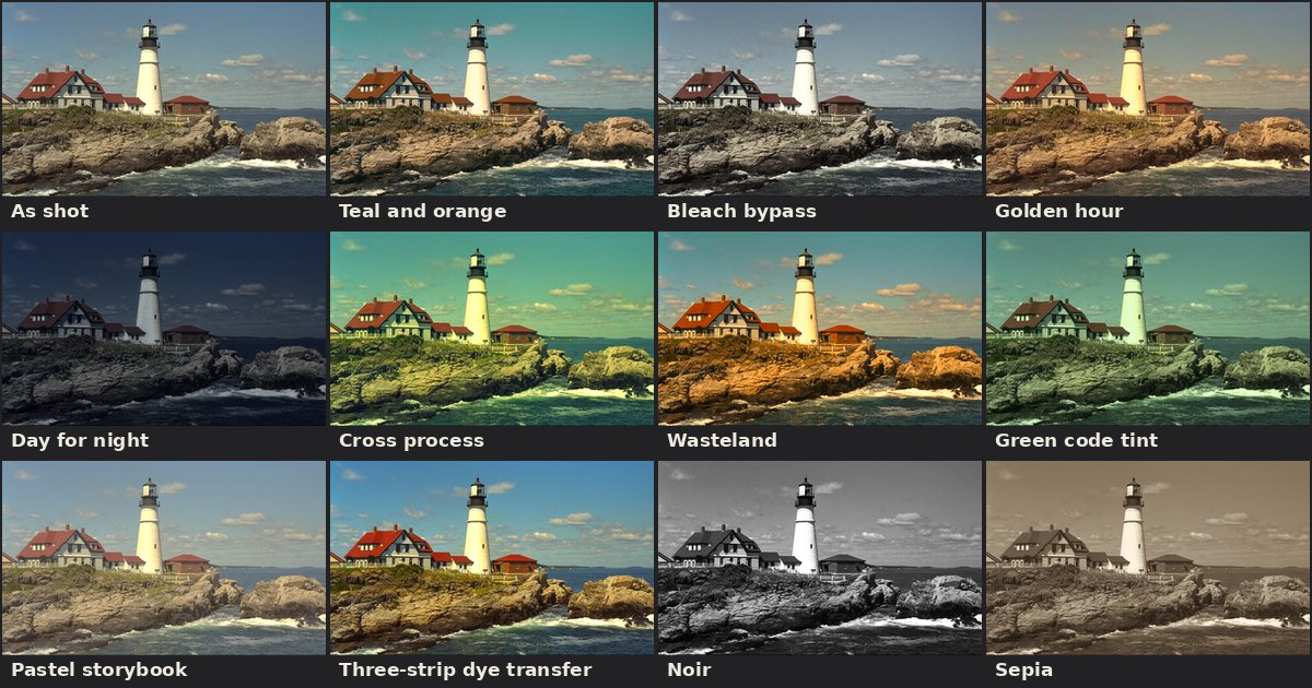
Film stocks and lab processes
These looks come from the chemistry of film: the character of particular stocks, and what happens when a lab processes them in an unusual way. They are the root of most of what people call a film look.
Print film
The gentle S-curve and slightly cool shadows of a projection print.
For most of cinema history nobody saw the camera negative. They saw a print, and the print stock added its own contrast curve, deep blacks, and a small split between cool shadows and warm highlights. That finishing step is a big part of what people mean by a film look.
Seen in: Almost every film released on 35mm. Modern print emulation is usually modelled on Kodak Vision 2383, the print stock most labs used at the end of the film era.
On set: Nothing special is needed. Expose normally and protect your highlights, because a print curve rolls them off but cannot recover clipped ones.
In the grade: Add a soft S-curve, pull a little saturation out of the brightest highlights, and tint the shadows very slightly toward blue-cyan. Keep it subtle: this look works as a base under other looks.
Warm portrait negative
Soft contrast, creamy skin and muted greens, like a portrait negative.
Colour negative films made for portraits and weddings are low in contrast, forgiving of overexposure, and tuned so that skin looks warm and even. Greens sit back and lean toward yellow, which keeps attention on faces.
Seen in: Wedding and editorial photography shot on stocks such as Kodak Portra, and the many presets that copy it.
On set: Overexpose by half a stop to a full stop if you are on film, or expose to the right on digital. Soft, broad light suits it: open shade, a big window, or bounce.
In the grade: Lower contrast a touch, lift the midtones, warm the white balance slightly, and reduce green saturation while nudging greens toward yellow. Leave the blacks a little open.
Cool green negative
Cooler balance with rich, slightly cyan greens and clean shadows.
Some negative films lean the other way from the warm portrait stocks. They render foliage as a deep, slightly blue green, keep skin on the neutral side, and let shadows drift toward cyan. The result feels calm and a little cool.
Seen in: Photography and films shot on Fujifilm negative stocks, including the Fujicolor photo films and the Eterna cinema line.
On set: Works well in forests, cities at dusk and overcast weather. Mixed fluorescent and daylight interiors also suit it because the green bias looks intentional.
In the grade: Cool the white balance slightly and add a few points of green tint. Rotate greens toward cyan, blues toward cyan, and put a faint green-teal tone in the shadows.
Punchy slide film
High contrast and very saturated colour, built for landscapes.
Slide film, also called reversal or transparency film, makes a positive image directly. The landscape favourites are contrasty and extremely saturated, with deep blue skies and vivid greens. The trade-off is narrow latitude: shadows block up and highlights clip quickly.
Seen in: Landscape and nature photography from the 1990s onward, most famously on Fujifilm Velvia.
On set: Meter carefully and protect highlights. Low sun, a polarizer and graduated filters are the classic tools. It is unkind to skin, which goes red, so keep people small in frame.
In the grade: Raise contrast and saturation together, deepen blues by lowering their brightness, and add vibrance. Watch reds and oranges for clipping.
Vintage slide film
Strong reds, deep blues and darker greens from mid-century slide film.
Older slide films had a look that is saturated but not garish: rich reds, dense blue skies, slightly dark and muted greens, and warm, creamy highlights. Colours feel solid and a little heavier than modern film.
Seen in: Decades of magazine photography shot on Kodachrome, which Kodak sold from 1935 until 2009. Steve McCurry's "Afghan Girl" portrait is one of the best-known Kodachrome frames.
On set: Direct sun and strong primary colours bring it out. Underexpose slightly to hold saturation in the highlights.
In the grade: Add contrast, boost and slightly darken reds, darken blues, and pull some saturation and brightness out of greens. Warm the highlights a little.
Tungsten night negative
Cool, cyan-leaning night colour with warm glowing highlights.
Cinema negative balanced for 3200 K tungsten light turns daylight and street lighting blue-green, while warm practical lamps stay warm. Shot at night, it gives teal shadows, glowing reds and a lot of atmosphere.
Seen in: Night street photography on tungsten-balanced stocks. CineStill 800T, which is Kodak Vision3 500T with the anti-halation backing removed, is known for the red glow it adds around bright lights.
On set: Shoot at night around neon, signs and shop windows. On digital, set the white balance near 3200 K and let the street lights go cool. A mist filter helps the highlights bloom.
In the grade: Cool the balance, tint shadows teal and highlights red-orange. The red halo around lights is a spatial effect that a LUT cannot add, so use a glow or halation tool for that.
Bleach bypass
Silver left in the film: hard contrast, crushed blacks, drained colour.
In normal processing the bleach step removes the silver and leaves only colour dyes. Skip or reduce it and a black-and-white silver image stays on top of the colour one. Contrast rises sharply, blacks get dense, and saturation drops.
Seen in: Nineteen Eighty-Four (1984), Saving Private Ryan (1998) and Minority Report (2002). Related silver-retention processes such as ENR and CCE were used on prints of films including Seven (1995).
On set: Light flatter than you normally would, because the process adds a lot of contrast. Fill shadows you want to keep and avoid hot highlights.
In the grade: Lower saturation to about half and push contrast hard. In a layer-based grade, overlay a black-and-white copy of the picture on the colour one, which is close to what the lab process does.
Cross process
Slide film in the wrong chemistry: yellow-green highlights and blue shadows.
Cross processing means developing a film in chemicals meant for a different type, most often slide film in colour negative chemistry. Contrast and saturation jump and the colour channels cross over, giving yellow-green highlights and blue or cyan shadows.
Seen in: Fashion photography and music videos of the 1990s, lomography, and parts of Three Kings (1999).
On set: Simple, bold subjects and hard light suit it. Skin goes strange, which is the point, so use it for mood more than beauty.
In the grade: Use the per-channel curves: steepen red and green, flatten and lift blue in the shadows, and lower blue in the highlights. Then add contrast and saturation.
Pushed negative
Underexposed and overdeveloped: more contrast, milky blacks, more grain.
Pushing a film means rating it faster than its box speed and developing it longer to compensate. You gain speed and lose shadow detail. Contrast and grain go up, blacks turn slightly milky, and shadows can pick up a colour cast.
Seen in: Low-light documentaries and plenty of night exteriors from the film era. Eyes Wide Shut (1999) was pushed two stops for its glowing, grainy interiors.
On set: This is a low-light look. Let practical lamps do the work and accept that deep shadows will hold little detail.
In the grade: Raise contrast, lift the black point a little so shadows look thin and grey, add a faint blue to the shadows, and add grain.
Expired film
Fogged, low-contrast colour with a magenta drift.
Film loses sensitivity and gains base fog as it ages, more so if stored warm. Out-of-date colour film usually comes back flat and grainy, with weak blacks and a colour shift that depends on the stock and how it was kept.
Seen in: Thrift-store cameras, experimental photography and album covers that want to feel found.
On set: If you are shooting real expired film, the usual rule of thumb is to add about one stop of exposure per decade past the date. Results are never fully predictable.
In the grade: Lift the blacks, lower the whites, cut contrast and saturation, and push the tint toward magenta. Add grain and a slight blue or red lift in the shadows.
Faded print
An old print whose cyan dye has gone, leaving pink-red faded colour.
The dyes in older colour prints are not stable. The cyan dye usually fades first, so the picture drifts toward pink and red, blacks turn brown, and the whole image loses contrast. Anyone who has seen a worn repertory print knows it.
Seen in: Archive prints from the 1950s to the 1970s, and films that imitate them for flashbacks or a grindhouse feel.
On set: Period wardrobe and props sell it more than lighting does. Keep the lighting simple and frontal, as older films often did.
In the grade: Lift the red channel in the shadows, lower green and blue gain, reduce contrast and saturation, and raise the black level. Add dirt and scratches separately if you want the full effect.
Instant film
Soft, low-contrast colour with green-tinted shadows and creamy whites.
Instant prints develop inside their own frame, and the chemistry leaves a recognisable signature: soft contrast, blacks that never reach true black, a cyan-green tone in the shadows, and yellow-cream highlights.
Seen in: Polaroid and Instax snapshots, and the continuity photos taken on film sets for decades.
On set: Direct flash at close range is the classic instant picture. Keep subjects simple and centred.
In the grade: Lift blacks and lower whites, tint shadows green-cyan and highlights pale yellow, soften contrast, and add a light vignette.
Super 8 home movie
Warm, grainy, vignetted small-gauge film.
Super 8 is a small film format that Kodak introduced in 1965 for home movies. The tiny frame means heavy grain and soft detail, and the simple cameras add vignetting and uneven exposure. Colours are warm and saturated.
Seen in: Family films of the 1960s and 1970s, and memory or flashback sequences in countless features, music videos and wedding films.
On set: Handheld, sunny, and a little overexposed. Zooms and whip pans feel right. Shooting 18 frames per second adds to the effect.
In the grade: Warm the balance, lower blue gain, add contrast and saturation, lift the blacks slightly, then add strong grain and a vignette. Gate weave and flicker need a separate effect.
Holiday snapshot negative
Warm, saturated consumer film with golden yellows.
The inexpensive colour negative films sold for holiday snapshots were made to look good from a one-hour lab: warm, punchy, and generous with yellows and reds. Greens lean yellow and skin looks tanned.
Seen in: Family albums from the 1980s to the 2000s, shot on films such as Kodak Gold and its supermarket rivals.
On set: Bright sun, on-camera flash indoors, and no particular care. It should feel casual.
In the grade: Warm the white balance, raise saturation, boost yellows, shift greens toward yellow, and add a little gold to the highlights.
Two-colour process
Only red-orange and blue-green, as in the earliest colour films.
Before full colour was practical, films were shot through two filters and printed in two dyes, a red-orange and a blue-green. Skin and reds look fine. True blues, yellows and purples cannot be reproduced, so skies go teal and yellows go pink.
Seen in: Two-colour Technicolor films of the 1920s. The Aviator (2004) recreated the look digitally for its early scenes, then switched to a three-strip look as the story reached the late 1930s.
On set: Costume and set colours matter more than light. Reds, oranges and teals read well. Anything yellow or purple will change colour.
In the grade: In a channel mixer, leave red alone and blend the green and blue channels into each other. Then add a little saturation and warmth.
Three-strip dye transfer
Dense, separated, highly saturated colour from the classic studio era.
The three-strip camera exposed three black-and-white negatives at once, one each for red, green and blue. Prints were made by transferring dyes, which gave dense, clean, strongly separated colour that modern film never quite matched.
Seen in: The Wizard of Oz (1939), Gone with the Wind (1939), The Red Shoes (1948) and Singin' in the Rain (1952). The process was used from the early 1930s to the mid 1950s.
On set: Production design drives it: bold costume colours and a lot of light. The original process was slow, so sets were lit bright and fairly flat.
In the grade: Use a channel mixer to subtract a little of each channel from the other two, which increases colour separation. Add contrast and keep the blacks clean.
Cinema and genre looks
These are palettes that audiences now connect with a kind of story. Most of them became possible, or at least practical, once films were graded digitally and a colourist could move individual colours around.
Teal and orange
Warm skin against cool shadows, the default blockbuster palette.
Skin tones sit in the orange part of the colour wheel, and teal sits opposite. Pushing everything that is not skin toward teal makes people stand out from any background. It became common once digital grading let colourists shift hues independently.
Seen in: A large share of studio films since the mid 2000s, with the Transformers series as the usual example.
On set: It works best when the scene already has the contrast: warm key light on faces and cooler light or blue set dressing behind them. A grade cannot separate colours that are not there.
In the grade: Tint shadows teal and highlights orange, and rotate blues toward cyan. Check skin on the vectorscope so it stays on the skin tone line and does not turn orange-red.
Golden blockbuster
Hot, golden, high-contrast action colour.
A warmer, glossier relative of teal and orange. The whole picture is pushed toward gold, contrast is high, and colours are saturated. Sunsets seem to last all day.
Seen in: Tony Scott's films, including Top Gun (1986) and Days of Thunder (1990), and the action films that followed them.
On set: Shoot toward a low sun and let it flare. Graduated colour filters on the sky were the original method. Smoke or dust in the air helps the light show.
In the grade: Warm the white balance well past neutral, add contrast and saturation, and put gold in the highlights. Keep some blue in the shadows so the picture does not turn into a flat orange wash.
Green code tint
A green cast over everything, with dark, dense shadows.
A green wash makes a world feel artificial and slightly sick. Skin loses its warmth, whites turn pale green, and shadows go dark olive.
Seen in: The Matrix (1999), where scenes inside the simulation carry a green tint and scenes in the real world lean blue.
On set: Green can come from the lights as well as the grade. Uncorrected fluorescent tubes, or plus green gel on your own lamps, give a head start. Keep red and warm colours out of the set.
In the grade: Shift the tint toward green, lower saturation, darken the midtones, and tint the shadows dark green. Decide how green you want faces before you commit.
Wasteland
Teal and orange turned all the way up.
Post-apocalyptic films used to be grey and desaturated. This look does the opposite: burning orange ground, deep teal sky, and saturation far beyond natural. It feels like a graphic novel.
Seen in: Mad Max: Fury Road (2015), whose makers chose strong colour partly because bleached, drained wastelands had become a cliche.
On set: Open desert under a hard sun, with clean separation between ground and sky. The more the location is already orange and blue, the less the grade has to force.
In the grade: Warm the balance, push saturation very high, rotate blues toward teal, and boost oranges. Expect to isolate skin so that faces do not go radioactive.
Cold thriller
Drained colour with a yellow-green cast and heavy shadows.
A controlled, uneasy look. Saturation is low, midtones are dark, and the colour that remains leans toward a yellow-green in the highlights and a green-teal in the shadows. Nothing looks healthy or comfortable.
Seen in: David Fincher's films, such as Seven (1995), Zodiac (2007) and Gone Girl (2014), and a great many crime dramas since.
On set: Motivated practical light, often warm sodium or green-tinged fluorescent, and deep shadows. Keep the palette of the set narrow.
In the grade: Lower saturation, darken midtones, add a few points of green tint, and split-tone with green-teal shadows and pale yellow highlights.
Nordic noir
Cold blue-grey with very little colour.
Winter light at high latitudes is low, blue and weak. This look takes that and drains it further: a blue-grey palette, pale skin, and one or two muted colours at most.
Seen in: Scandinavian crime dramas such as The Killing and The Bridge, and the wider genre they started.
On set: Overcast days, bare interiors, and wardrobe in grey, navy and black. Avoid direct sun.
In the grade: Cool the white balance, halve the saturation, darken the midtones slightly, and tint the shadows steel blue.
War film
Harsh, desaturated, olive-grey combat colour.
Colour is pulled down until uniforms, mud and skin are nearly the same tone. Contrast is hard and the picture is gritty. It borrows from bleach bypass and from the look of colour newsreel footage.
Seen in: Saving Private Ryan (1998) and Band of Brothers (2001), which set the template for modern war films.
On set: Those productions also used a narrow shutter angle, such as 45 or 90 degrees, to make motion staccato. Smoke and overcast skies help.
In the grade: Cut saturation to around 45 percent, add strong contrast, lean the tint slightly green, and add grain.
Sci-fi steel
Cool blue-steel colour with clean, bright highlights.
Technology on screen tends to be blue. This look cools everything, lowers saturation, and tints both shadows and highlights blue so that metal, glass and screens look crisp. A little warmth is kept in skin so faces do not look dead.
Seen in: Minority Report (2002) and Tron: Legacy (2010), among many others.
On set: Hard, cool sources, practical screens and LED strips, and reflective surfaces. Daylight-balanced fixtures on a tungsten-balanced camera give the base shift.
In the grade: Cool the balance, reduce saturation, tint shadows and highlights blue, and protect the skin hue range with a small saturation boost.
Yellow heat
A hot, overexposed yellow wash.
A heavy yellow cast with blown highlights and grain makes a place feel hot, dry and harsh. It is a strong storytelling device because the audience knows where they are within a single frame.
Seen in: Traffic (2000) used it for its Mexico storyline and a cold blue for its Ohio scenes. Since then the yellow filter has been used so often for Mexico and South Asia that it is widely criticised as a lazy stereotype. Use it for heat, not as shorthand for a country.
On set: Tobacco or yellow filters on the lens were the original method, with deliberate overexposure and a hard overhead sun.
In the grade: Add a yellow filter over the image, warm the balance, raise contrast, lift the midtones, and add grain.
Pastel storybook
Bright, soft pastels with pink highlights.
A light, flat, cheerful palette. Contrast is low, midtones are bright, blacks are lifted, and colours are soft pinks, yellows and powder blues.
Seen in: Wes Anderson's films, especially The Grand Budapest Hotel (2014).
On set: This look is made in production design. Sets, costumes and props are painted and chosen in the palette, then lit softly and evenly. The grade only finishes it.
In the grade: Lower contrast, lift midtones and blacks, add a pink tone to the highlights and a pale blue to the shadows, and boost yellows.
Golden green fairy tale
Saturated reds, yellow-greens and gold, with blue removed.
A warm, heightened storybook palette built from red, green and gold. Blue is muted so that it does not compete. Skin is golden, and the world feels richer than real life.
Seen in: Amelie (2001), which was graded digitally to push those three colours.
On set: Dress the set in reds and greens and keep blue objects out of frame, apart from a deliberate accent. Warm, soft light on faces.
In the grade: Warm the balance, add green tint, raise saturation, boost reds, shift greens toward yellow, and desaturate blues.
Neon night
Deep blue shadows and hot pink highlights.
City night scenes lit by signs instead of film lights. Shadows fall into saturated blue or violet, highlights go pink and magenta, and contrast is high.
Seen in: Blade Runner (1982), Drive (2011) and the John Wick films.
On set: This look comes from the lighting. Use coloured practical sources, wet streets for reflections, and haze. A grade on a daylight photo will only hint at it.
In the grade: Lower exposure slightly, add contrast and saturation, tint shadows deep blue and highlights magenta.
Magenta and cyan
Two-colour club lighting: hot pink against cyan.
Pink or magenta light on one side and blue or cyan on the other. Online it is often called bisexual lighting, after the colours of the bisexual pride flag. It reads as nightlife, youth and heightened emotion.
Seen in: Atomic Blonde (2017), the San Junipero episode of Black Mirror (2016), and a lot of music videos.
On set: Two RGB fixtures or gelled lamps from opposite sides. Keep white light out of the scene so the two colours stay pure.
In the grade: Pull warm hues toward magenta and cool hues toward cyan, tint shadows cyan and highlights pink, and add saturation.
Dusty western
Warm, dry, sun-bleached earth tones with pale skies.
Westerns live in dust and hard sun. Colour is warm and somewhat faded, skies are pale, shadows are brown, and skin is weathered.
Seen in: Sergio Leone's westerns of the 1960s, and more muted modern examples such as The Assassination of Jesse James by the Coward Robert Ford (2007).
On set: Shoot in hard midday light or at the ends of the day, with dust in the air. Earth-toned wardrobe does much of the work.
In the grade: Warm the balance, lower saturation, desaturate blues so the sky goes pale, and add brown to the shadows and straw yellow to the highlights.
Sickly green horror
Dark, murky green with almost no warmth.
Green-cyan casts make skin look ill and rooms look damp. Combined with low saturation, dark midtones and a vignette, the frame feels dirty and unsafe.
Seen in: Saw (2004) and The Ring (2002), and many horror films after them.
On set: Old fluorescent tubes, bare bulbs and practical sources that leave most of the frame dark. Avoid any clean white light.
In the grade: Cool the balance, add green tint, halve the saturation, darken the midtones, tint the shadows green, and add a vignette.
Bright romantic comedy
Bright, warm, clean and flattering.
Nothing is hidden and nobody looks bad. The picture is high key, gently warm and moderately saturated, with open shadows and healthy skin.
Seen in: Most studio romantic comedies and sitcoms.
On set: Large soft sources, plenty of fill, and a backlight to separate hair from background. Locations are bright and tidy.
In the grade: Lift midtones, warm the balance slightly, add vibrance, and keep contrast moderate. Add a point or two of magenta to keep skin rosy.
Blue-green gloom
A cold blue-green cast with pale, drained skin.
Everything is tinted toward a cold blue-green and skin is desaturated until it looks pale. It suggests rain, forests and permanent overcast.
Seen in: Twilight (2008) and the series Ozark (2017 to 2022).
On set: Overcast weather or deep shade under trees. Keep warm light out of the scene.
In the grade: Cool the balance, add green tint, lower saturation, reduce saturation further in the skin hue range, and tint shadows teal.
Warm red future
Soft warm reds and pinks with blue taken out.
A gentle future. The palette is built on reds, corals and warm neutrals, contrast is soft, and blue is close to absent.
Seen in: Her (2013), whose makers deliberately kept blue out of the frame.
On set: Wardrobe and set dressing in warm colours, and soft, diffused daylight. Remove blue objects from the set before the grade has to.
In the grade: Warm the balance, add magenta tint, strongly desaturate blues, boost reds, and lower contrast slightly with lifted blacks.
Amber and black
Deep amber light falling into solid black.
Two tones only: a saturated amber or orange-red, and black. Midtones are dark, contrast is very high, and other colours are suppressed.
Seen in: The Batman (2022), and the orange Las Vegas sequence of Blade Runner 2049 (2017).
On set: A single strong warm source, such as sodium street light, fire or a low sun through smoke, with no fill. Silhouettes suit it.
In the grade: Add an amber filter, darken the midtones a lot, raise contrast, desaturate blues, and add a vignette.
Seventies fade
Warm, soft, slightly brown colour with open blacks.
Films of the early 1970s often look warm, soft and a little underexposed, with brown-olive shadows and lifted blacks. Some of that came from slower lenses and stocks, some from flashing the film, and some from ageing prints.
Seen in: McCabe and Mrs. Miller (1971), where the negative was flashed to mute the colour, and The Godfather (1972) with its amber, shadowy interiors. The Holdovers (2023) rebuilt the look digitally.
On set: Warm practical lamps, top light, and earth-toned wardrobe. Older zoom lenses and a mist filter add softness.
In the grade: Warm the balance, lower contrast and saturation, lift the blacks, shift greens toward olive, tint shadows brown, and add grain.
Grey dystopia
Ash-grey colour with a faint green cast.
The world after things have gone wrong: little colour, grey skies, and a slight green-grey tint. It is flatter and more ordinary than the war film look, which makes it feel plausible.
Seen in: Children of Men (2006) and The Road (2009).
On set: Overcast skies and available light. Rubble, concrete and worn clothing in neutral tones.
In the grade: Cut saturation to about 45 percent, add moderate contrast, lean the tint slightly green, and lift the blacks a touch.
Dust bowl sepia
Greens turned to dry yellow-brown.
Lush green landscapes are shifted to a dusty, sun-baked yellow, and the whole picture takes on the tone of an old hand-tinted photograph.
Seen in: O Brother, Where Art Thou? (2000). It was shot in a green Mississippi summer and became the first Hollywood feature to be graded digitally from start to finish, mainly to turn those greens golden.
On set: Nothing special. The point of this look is that the grade changes the season after the fact.
In the grade: Select the green hues, rotate them toward yellow and desaturate them heavily. Warm the balance, lower overall saturation, and add straw-coloured highlights.
Sunlit high key
Very bright, clean daylight with soft pastel colour.
Everything is bright, open and clearly visible. Colours are fresh, whites are clean and shadows are thin. Used for horror, the brightness becomes unsettling because there is nowhere to hide.
Seen in: Midsommar (2019), a horror film that takes place almost entirely in bright daylight.
On set: Overexpose slightly in open sun or under a big silk. White and pale wardrobe increases the effect.
In the grade: Lift the midtones a lot, keep contrast low, add vibrance, and raise the brightness of greens and blues.
Natural drama
A restrained, natural grade with gentle contrast.
Most drama is graded to be unnoticed. Contrast is slightly increased, saturation is slightly reduced, shadows are a little cool and highlights a little warm. The audience should see the story, not the grade.
Seen in: Most contemporary prestige dramas.
On set: Motivated, naturalistic lighting. Good exposure and consistent white balance matter more here than in any stylised look.
In the grade: Small moves only: a little contrast, saturation down by about a tenth, and a faint cool and warm split between shadows and highlights.
Light and time of day
These looks copy what real light sources do to a scene. They are the most useful ones to learn, because every one of them can be created on set with the right lamp, gel or time of day, and they always look better that way than in the grade.
Golden hour
Low, warm sun shortly after sunrise or before sunset.
When the sun is near the horizon its light passes through more atmosphere, which scatters the blue out of it. What reaches the subject is warm, soft and directional, with long shadows and a slightly magenta-blue sky opposite the sun.
Seen in: Days of Heaven (1978), much of which was shot in the short window around sunset, and nearly every car advert.
On set: Plan with a sun position app, because the window is short. Backlight the subject and bounce warm light back into the face. Keep the camera white balance at daylight so the warmth is recorded, not corrected away.
In the grade: Warm the balance by 50 mired or more, add a little magenta, and put gold in the highlights. To fake it on a midday shot you also need to soften the contrast, and it never fully convinces because the shadows are in the wrong place.
Blue hour
Deep blue twilight with the sun below the horizon.
For a short time before sunrise and after sunset the sky is the only light source. It is very blue, soft and shadowless, and windows and street lights glow warm against it.
Seen in: City skylines, establishing shots, and any scene that wants artificial light and sky in balance.
On set: You have roughly 20 to 30 minutes at mid latitudes, longer nearer the poles. Rehearse before and shoot fast. Turn on every practical light in frame.
In the grade: Cool the balance strongly, lower exposure a little, and tint the shadows blue. A slight pink in the highlights imitates the afterglow near the horizon.
Day for night
Daylight footage darkened and cooled to pass for night.
Night scenes are hard to light over large areas, so productions have long shot them in daylight and darkened them. The French name for the technique is la nuit americaine. Done well, the sun plays the moon.
Seen in: Countless westerns, the night chase in Mad Max: Fury Road (2015), and Nope (2022), which paired an infrared camera with a film camera to get dark skies.
On set: Shoot in hard sun, backlit or side lit, underexposed by one and a half to two stops. Keep the sky out of frame or plan to replace it. Avoid visible practical lights unless you can make them brighter than the daylight.
In the grade: Lower exposure, cool the balance strongly, halve the saturation and darken the blues. Windows, headlights and stars have to be added as effects.
Moonlight
The cool blue-cyan that films use for moonlit night.
Real moonlight is reflected sunlight and is actually slightly warmer than daylight, at around 4100 K. We see it as blue because our eyes shift toward blue sensitivity in very dim light. Film follows perception, so screen moonlight is blue or cyan.
Seen in: Almost every night exterior. The exact colour goes in and out of fashion, from deep blue in the 1980s to today's paler cyan.
On set: A large, hard, high source with a blue gel such as half CTB, sometimes with a little green added. Underexpose faces by a stop or two and keep some edge light so shapes read.
In the grade: Lower exposure, cool the balance, add a touch of green, reduce saturation, and tint the shadows deep blue.
Overcast
Soft, cool, low-contrast light under cloud.
Cloud turns the whole sky into one enormous soft source. Shadows nearly vanish, contrast drops, colours go quieter, and the light is cooler than direct sun, often 6500 K or higher.
Seen in: British and Pacific Northwest drama, and any production that had to keep shooting when the weather turned.
On set: It is flattering for faces and easy to match between shots. Add negative fill, such as a black flag on one side, to get some shape back.
In the grade: Cool the balance slightly, lower contrast and saturation, and lift the blacks a little.
Warm tungsten
Tungsten lamps seen by a daylight-balanced camera.
A tungsten lamp burns at about 3200 K. If the camera is set for 5600 K daylight, that light records as a strong orange. It is the look of a lamp-lit room seen from outside, or a home interior left uncorrected.
Seen in: Evening interiors where warmth is the point, and windows glowing in blue hour exteriors.
On set: Leave the camera at daylight and light with tungsten or warm LED. To reduce the effect, set the camera part way, around 4300 K. The full gap between 3200 K and 5600 K is 134 mired.
In the grade: Warm the white balance. This look is a pure white balance shift, so you can also get it by moving the white balance slider above.
Cool daylight
Daylight seen by a tungsten-balanced camera.
The reverse case. With the camera set to 3200 K, daylight records as a strong blue. It was a common way to shoot day-for-night and cold exteriors on tungsten film without a correction filter.
Seen in: Cold, clinical exteriors and a lot of 1990s and 2000s thrillers.
On set: Set the camera to tungsten outdoors. Then any tungsten lamp in the scene looks white, and daylight goes blue around it, which is a quick way to get colour contrast.
In the grade: Cool the white balance. Like warm tungsten, this is a pure white balance shift.
Sodium vapour
The orange monochrome of older street lighting.
Sodium street lamps put out most of their light in a narrow orange band. Under them almost all colour information disappears: everything is a shade of orange, and no white balance setting will bring the other colours back.
Seen in: Night exteriors in most cities until LED replaced them. Collateral (2004) is known for capturing the sodium glow of Los Angeles at night on early digital cameras.
On set: If the real lamps are gone, a warm LED with a deep amber or urban sodium gel is the usual substitute. Add a little of a second colour somewhere in frame for relief.
In the grade: Reduce saturation, then tone the whole image orange. The picture should be close to a monochrome.
Uncorrected fluorescent
The green cast of old fluorescent tubes.
Older fluorescent tubes have a spike of green in their output that the eye ignores and the camera does not. Left uncorrected, skin goes sallow and whites go pale green. It reads as offices, hospitals, subways and late nights.
Seen in: Institutional interiors in thrillers and dramas, where the unpleasantness is deliberate.
On set: To remove it, put minus green gel on the tubes or add magenta in camera. To keep it and stay consistent, put plus green on your own lights so they match the room.
In the grade: Shift the tint toward green by 10 to 20CC and cool the balance slightly.
Mercury vapour
Cold blue-green industrial light.
Mercury vapour lamps give a cold blue-green light that is weak in red, so skin looks grey and lifeless. They lit car parks, warehouses and sports fields for decades.
Seen in: Car parks, loading docks and night exteriors that want a cold, exposed feeling.
On set: A daylight LED with a little plus green and some blue gives a similar feel. It pairs well with sodium orange in the background.
In the grade: Cool the balance, add green tint, lower saturation, and tint shadows teal.
Firelight
Deep orange-red light with heavy falloff into darkness.
Fire is one of the warmest sources there is, at roughly 1800 to 2000 K. It is low, it flickers, and it falls off fast, so faces glow and the background drops to black.
Seen in: Campfire scenes in every genre.
On set: Use real flame where it is safe, and support it with warm LED or gelled lamps on a flicker dimmer placed low. Keep the fill off.
In the grade: Warm the balance as far as it will go, lower exposure, add contrast and a vignette, and tint the highlights red-orange.
Candlelight
Soft, dim golden light.
A candle flame is about 1850 to 1900 K. It is warm like firelight but gentler and steadier, and with several candles the light wraps softly around faces.
Seen in: Barry Lyndon (1975), whose candlelit scenes were shot by real candlelight using f/0.7 lenses originally made for NASA.
On set: Modern cameras can expose by real candles at high ISO. Double-wick candles give more light. Hide small warm LEDs behind them for extra exposure on faces.
In the grade: Warm the balance strongly, lower exposure slightly, keep contrast moderate, and add gold to the highlights and a soft vignette.
Desert heat
Bleached, bright and warm, with a pale sky.
Heat on screen is brightness more than colour. Highlights are bleached, the sky is pale, shadows are short, and everything is a little warm and dusty.
Seen in: Desert scenes from Lawrence of Arabia (1962) onward.
On set: Shoot near midday for the hard overhead light, and use long lenses to compress heat shimmer. Overexpose slightly.
In the grade: Lift the midtones, warm the balance, lower saturation, desaturate and brighten the blues, and tint highlights pale yellow.
Winter cold
Bright, blue, low-saturation cold.
Cold reads as blue and clean. The picture is fairly bright, with blue shadows, white highlights and muted colour.
Seen in: Snow scenes such as those in Fargo (1996) and The Revenant (2015).
On set: Snow acts as a giant bounce, so contrast is naturally low. Expose so that snow sits just under clipping, and shoot early or late for some shape.
In the grade: Cool the balance, lift the midtones slightly, lower saturation, and tint the shadows blue.
Underwater
Blue-green water colour with reds absorbed.
Water absorbs red light first, then orange and yellow. A few metres down, reds have largely gone and everything is blue-green. Contrast is low because of particles in the water.
Seen in: Any underwater sequence shot in natural light.
On set: Underwater shooters bring the red back with a red filter, with a custom white balance, or by lighting the subject from close range. For a dry-for-wet scene, use haze, slow motion and moving light patterns from above.
In the grade: Add a cyan filter, cool the balance, desaturate and darken reds, and lift the blacks slightly.
Magenta dusk
Pink and violet sky light just after sunset.
After the sun sets, the sky opposite can turn pink and violet for a few minutes. The light on the ground picks up that colour and everything goes soft and magenta.
Seen in: Sunset scenes in La La Land (2016) and many music videos.
On set: It cannot be scheduled reliably. Be ready, shoot fast, and hold the white balance at daylight so the camera does not neutralise the colour.
In the grade: Add a strong magenta tint, a little warmth, and tint the shadows violet and the highlights pink.
Heavy mist
Flat, pale and soft, as if seen through fog.
Fog and mist scatter light. Blacks lift to grey, contrast and saturation collapse, and distant objects fade into the background. The picture becomes quiet and soft.
Seen in: Forest and coastal scenes, period dramas and horror.
On set: A hazer or fog machine gives the real thing, with depth: near objects stay dark and far ones go pale. Backlight it to make it visible.
In the grade: Lift the blacks a lot, lower the whites, and cut contrast and saturation. A grade affects the whole frame equally, so it cannot give the depth that real fog does.
Photo and social styles
These styles grew up in stills photography and on social media, and they now turn up in video work too, especially weddings, travel and brand films.
Light and airy
Bright, soft and pastel, with pale greens.
A wedding and lifestyle photography style built on overexposure. Skin is bright and smooth, shadows are open, and greens are lightened and desaturated so that foliage does not dominate.
Seen in: Wedding, newborn and lifestyle photography, and the brands that sell to those audiences.
On set: Shoot wide open in open shade or backlit sun, and overexpose by up to a stop. White and pale clothing helps.
In the grade: Lift the midtones a lot, lower contrast, lift the blacks slightly, warm the balance, and lighten and desaturate the greens.
Dark and moody
Deep shadows, muted greens and warm skin.
The opposite of light and airy. Exposure is low, shadows are deep, greens are dark and desaturated, and skin stays warm so that people glow against the background.
Seen in: Wedding, food and outdoor portrait photography.
On set: Underexpose slightly and use a single soft source from the side, such as a window, with no fill.
In the grade: Darken the midtones, add contrast, desaturate and darken the greens, keep oranges, and add a vignette.
Matte fade
Lifted blacks with a soft blue tone in the shadows.
The black point is raised so that the darkest parts of the picture are dark grey, not black. That gives a flat, printed-on-matte-paper feel. A blue or teal tint in the lifted shadows usually goes with it.
Seen in: Phone photo apps of the 2010s and a lot of indie film and travel video.
On set: Nothing special. It suits simple compositions with large dark areas, where the lifted blacks are visible.
In the grade: Raise the bottom of the curve so that black maps to about 8 or 9 percent, lower the top slightly, and tint the shadows blue.
Travel orange and teal
Orange skin and sand against teal water and sky.
The photo version of teal and orange, pushed further. Blues and greens are both rotated toward teal, warm colours toward orange, and saturation is high.
Seen in: Travel photography on social media, where it peaked around 2017 to 2019.
On set: Beaches, deserts, city streets at dusk: anywhere with warm ground or skin against sky or water.
In the grade: Rotate blues and greens toward teal and warm hues toward orange, then add saturation. Reduce green saturation so that foliage does not go neon.
Earth tones
Browns, olives and warm neutrals with blue removed.
A muted, warm palette where greens become olive, blues nearly vanish, and oranges and browns carry the picture. It feels autumnal and calm.
Seen in: Lifestyle, outdoor and fashion photography, and the dark academia aesthetic.
On set: Autumn locations, wood, wool and leather. Overcast light keeps the palette soft.
In the grade: Warm the balance, lower saturation, rotate greens toward yellow and desaturate them, desaturate blues, and tint the shadows brown.
Moody forest
Deep, cool greens with dark shadows.
Forest greens are darkened and shifted toward blue-green, yellows are reduced, and the picture is kept dark and cool. Mist and rain suit it.
Seen in: Outdoor and adventure photography, especially from the Pacific Northwest.
On set: Overcast or foggy days in dense forest. A person in a red or yellow jacket gives the classic accent.
In the grade: Cool the balance, darken the midtones, darken greens and shift them toward cyan, reduce yellows, and tint the shadows teal.
Clean commercial
A bright, accurate, slightly polished picture.
Product and corporate work usually wants colour that is correct and attractive, with nothing stylised. This is a modest lift in brightness, contrast and vibrance and no colour cast.
Seen in: Product shots, interviews and brand films.
On set: Use a grey card or colour chart so that white balance and product colours are right before any grading.
In the grade: Small increases in contrast, brightness and vibrance. Check product and brand colours against a reference.
Vivid landscape
Saturated colour with deep skies and strong greens.
A general-purpose landscape grade: more saturation and contrast, darker blue skies, and fuller greens. It is less extreme than the punchy slide film look.
Seen in: Landscape and travel photography, and television nature programmes.
On set: A polarizer deepens the sky and cuts reflections from water and leaves before the grade begins.
In the grade: Add saturation and vibrance, raise contrast, darken blues, and boost greens.
Cool flash
Crisp, cool, hard-flash colour from early digital cameras.
Compact digital cameras of the early 2000s gave cool, contrasty pictures, especially with the built-in flash: bright subject, cyan-tinged whites and a dark background.
Seen in: Party photos from the 2000s, and current fashion and music work that revives the look.
On set: Direct on-camera flash at night, with the subject close and the background several metres away.
In the grade: Cool the balance, add a little green, raise contrast and saturation, and tint the highlights pale cyan.
Vintage postcard
Faded warm colour with cream highlights and pale skies.
Old printed postcards have yellowed paper, weak blacks and soft, slightly off colours. Skies drift toward pale cyan and highlights toward cream.
Seen in: Retro travel imagery and title sequences.
On set: Wide, static, postcard-style compositions in sunshine.
In the grade: Lower saturation and contrast, lift blacks and lower whites, warm the balance, tint highlights cream, and shift blues toward pale cyan.
Soft pastel
Very low contrast with pale pink and lilac tones.
Contrast is taken right down, midtones are lifted, and the remaining colour is soft and pale, with pink highlights and lilac shadows. It is gentler and cooler than light and airy.
Seen in: Beauty, fashion and dreamy music video work.
On set: Soft frontal light, pale backgrounds and a diffusion filter.
In the grade: Lower contrast, lift midtones and blacks, lower saturation, and tint the shadows lilac and the highlights pink.
Black and white, and toned
Black and white is a set of choices, not one look. What matters is how each colour is turned into grey, how hard the contrast is, and whether the print is toned.
Neutral black and white
A plain conversion that keeps natural brightness.
Each colour is turned into the grey that matches how bright it looks to the eye. It is the honest starting point for black and white, with no filter effect.
Seen in: Documentary and reportage, and modern black-and-white films such as Roma (2018).
On set: Without colour, the picture depends on light, shape and texture. Light for tonal separation between subject and background.
In the grade: Remove saturation using luminance weighting, then add a small amount of contrast.
Noir
Hard contrast, deep blacks and pools of light.
Film noir is a lighting style before it is a grade: hard sources, strong shadows, faces half lit, and large areas of black.
Seen in: Double Indemnity (1944), The Third Man (1949) and their many descendants.
On set: Use hard, undiffused light from the side or above, little or no fill, and shadows from blinds or railings. Wet streets and smoke add depth.
In the grade: Convert to black and white, push contrast very high, darken the midtones, and add a vignette and grain.
Red filter
Black skies and bright skin, as through a red lens filter.
On black-and-white film a red filter blocks blue light. Blue skies go almost black, clouds stand out, foliage darkens, and skin lightens and smooths.
Seen in: Dramatic landscape photography. Ansel Adams used a deep red filter for his 1927 photograph of Half Dome.
On set: On a colour camera you can decide later by keeping the colour file. On film, a red filter such as a Wratten 25 costs about three stops.
In the grade: In the black-and-white mixer, take almost everything from the red channel and subtract a little blue.
Green filter
Lighter foliage and stronger skin texture.
A green filter lightens leaves and grass and darkens reds. Skin gets a little darker and more textured, and lips darken, which many photographers like for portraits of men and for landscapes with a lot of foliage.
Seen in: Classic outdoor portraiture and woodland landscapes.
On set: Useful when green foliage and a red or brown subject would otherwise come out as the same grey.
In the grade: In the black-and-white mixer, take most of the image from the green channel.
Orthochromatic
Blind to red: dark lips and skin, pale skies.
Early film could not see red light. Red lips and ruddy skin came out dark, blue eyes came out pale, and blue skies came out white. It gives faces a weathered, antique look.
Seen in: Photography and cinema before the late 1920s. The Lighthouse (2019) recreated it with a custom filter on black-and-white film.
On set: Skin blemishes and texture are emphasised, so it suits characterful faces. Make-up for the original stocks used unusual colours to compensate.
In the grade: Build the black-and-white image from the green and blue channels only, with no red.
Infrared
White foliage and a dark sky.
Infrared film records light beyond red that the eye cannot see. Healthy leaves reflect a lot of it and come out white, clear skies come out black, and skin looks smooth and pale.
Seen in: Fine-art landscape photography, shot on films such as Kodak HIE until it was discontinued.
On set: Real infrared needs an infrared filter and either infrared film or a converted digital camera. Bright sun on foliage gives the strongest effect.
In the grade: A channel mix can imitate the tones by brightening green and red and subtracting blue. It is only an imitation, because a normal camera has not recorded any infrared.
Soft silver
Low-contrast greys with open shadows.
A gentle black and white with a long, smooth tonal scale. Nothing is pure black or pure white. It suits skin and quiet scenes.
Seen in: Portraiture and fashion photography.
On set: Large soft sources and plenty of fill.
In the grade: Convert to black and white, lower contrast, lift the blacks and the midtones, and lower the whites slightly.
Gritty press
Pushed, grainy, high-contrast black and white.
The look of fast black-and-white film pushed in the developer to cope with bad light: strong grain, hard contrast, and shadows with little detail.
Seen in: Mid-century photojournalism and street photography, often on Kodak Tri-X.
On set: Available light, handheld, close to the subject.
In the grade: Convert to black and white, add strong contrast, lift the black point slightly, and add heavy grain.
Sepia
Warm brown tone, like an antique print.
Sepia toning replaces the silver in a print with a brown compound that also lasts longer, which is why so many surviving old photographs are brown.
Seen in: Nineteenth and early twentieth century photographs, and flashbacks ever since. The Kansas scenes of The Wizard of Oz (1939) were sepia toned.
On set: As for any black and white. Period costume and props do the rest.
In the grade: Convert to black and white, then map the tones onto a ramp that runs from dark brown through tan to cream.
Cyanotype
Prussian blue and white, like a blueprint.
The cyanotype is one of the oldest photographic processes. It uses iron salts, not silver, and gives an image in deep Prussian blue.
Seen in: John Herschel invented it in 1842, and Anna Atkins used it for her books of botanical prints soon after. It is also the process behind architectural blueprints.
On set: Bold shapes and silhouettes with clear outlines suit it best.
In the grade: Convert to black and white, then map the tones onto a ramp that runs from near-black blue through mid blue to pale blue-white.
Selenium tone
Neutral greys with cool purple-brown shadows.
Selenium toning was used mainly to make silver prints last longer and to deepen the blacks. Its colour is subtle: a cool, slightly purple-brown shift, strongest in the shadows.
Seen in: Fine-art darkroom prints. Ansel Adams toned many of his prints in selenium.
On set: As for any black and white.
In the grade: Convert to black and white, add contrast, and add a slight purple-brown tone that fades out toward the highlights.
Warm platinum
Soft, warm-neutral tones with a long grey scale.
Platinum and palladium prints have a matte surface, a very long and gentle tonal range, and a warm neutral colour. Shadows never block up.
Seen in: Fine-art portraiture and still life from the 1880s to the present.
On set: Soft light and subjects with fine texture.
In the grade: Convert to black and white, lower contrast, lift the blacks slightly, and map the tones onto a warm grey ramp.
Split-tone silver
Black and white with cool shadows and warm highlights.
Split toning gives the shadows and the highlights different colours. Cool shadows with warm highlights is the most common pairing, and it adds depth without looking coloured.
Seen in: Darkroom prints toned in two baths, and a great deal of modern black-and-white film and television.
On set: As for any black and white.
In the grade: Convert to black and white, then tint the shadows blue and the highlights cream. Keep both subtle.
Common questions
Is a look the same thing as a LUT?
No. A look is the creative intent: how the colour and contrast of the picture should feel. A LUT is one way of storing a look as a table of numbers. Looks can also be stored as grades in your software, as camera settings, or as lighting and design choices that never touch a grade at all.
Are the LUT downloads free?
Yes. There is no charge and no sign-up. Each .cube file is made in your browser from the look and the trims you have set.
Which looks are the most used in film?
The ones you will meet most often are teal and orange, a print film curve, bleach bypass, and day for night. For stills, warm portrait negative and matte fade are the common starting points.
Can I use these LUTs on log footage?
Not directly. They are made for pictures that are already in Rec 709 or sRGB. Put a log to Rec 709 conversion before the look. Applying one of these to raw log footage will give a flat, wrong-looking result.
Which software opens a .cube file?
DaVinci Resolve, Adobe Premiere Pro, Final Cut Pro and most other grading and editing software read .cube files, and so do many on-set monitors and LUT boxes. Check your monitor’s manual for the LUT size it accepts. These are 33-point files.
Why does a look seem different on my photo?
A look changes colours according to what they already are. A photo that is darker, flatter, warmer or more saturated than the samples gives the look different material to work on. Correct exposure and white balance first with the trims, then lower the strength until it sits well.
Is my photo uploaded anywhere?
No. When you use your own photo it is opened and processed inside your browser. It is not sent to Luminxel or anyone else, and it is gone when you close or reload the page.
Should I get the look on set or in the grade?
As much as you can on set. Lighting, gels, wardrobe and set colour decide what colours exist in the frame, and a grade can only move what is there. Our colour gel calculator works out the gel for a given shift. Shooting a colour chart or grey card at the start of each setup gives the colourist a clean base to build the look on.
Are these the same looks as in the Luminxel app?
The app has its own smaller set of looks that you can put over a scout photo or the live camera view. This page has a larger library and adds the .cube download.
Sample photos are from the Kodak Lossless True Color Image Suite, released by the Eastman Kodak Company for unrestricted use.